5 Ways to Improve Your Website Today!
Having a website should never be underestimated; it plays a crucial role in your digital marketing efforts and improves your customer journey. But do you ever look at your website and wonder whether it's making a difference?
Every advert you run is likely driving traffic back to your website, so considering your customer journey is crucial. After all, your website is the place that gives your customers a clear idea about your brand; including who you are and what you offer.
Make Navigation Simple.
It shouldn't be hard for your customers to find what they're looking for when they visit your website. When they land on the homepage, they should be able to see who you are, what you're offering and where to book.
Tip: Use your website navigation bar to display important information and pages you want to drive customers too. Make it clear to your customers what you're offering (camps, classes, merchandise etc.) and try to limit the number of actions they need to take.
Create an Efficient Booking Journey.
Don’t let your hard efforts go to waste by giving potential customers a reason to drop off. Remember that you always want potential customers to achieve something with every click through your website. If they get lost, they will give up and abandon what they were looking for.
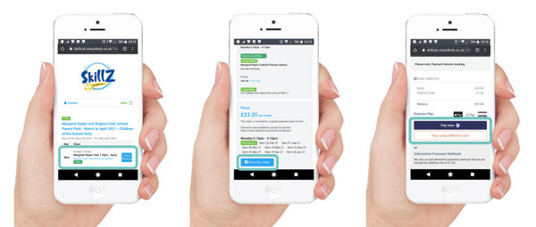
Ashley from Skillz has designed a smooth customer journey straight from his homepage. He has all the important information in the navigation bar including; finding a class, football at home, kids parties (upselling!), and the contact us section. His customers know straight away what he offers with easy contact options. And his customers can also book classes in 3 clicks as he’s integrated the ClassForKids booking system to his website.
Improve your booking journey like Ashley.

Be Bold with your Call-to-Actions.
Make it glaringly obvious what you want your customers to do - never leave any doubt. Call-to-actions (CTAs) go a long way in helping potential customers navigate your website and improve their journey.
Tip: Choose bold, time-sensitive and action CTAs to make your customers take action. Why not try increasing trials with a CTA like 'Access Free Trial Code NOW' or increase camp attendance with a 'Limited Time Offer' CTA.
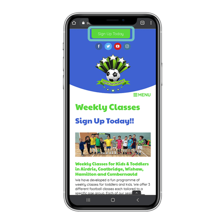
Soccer Stars Academy make great use of time-sensitive CTAs on their website encouraging customers to take action quickly. They're continually asking potential customers to ‘take action today’.

Embrace Whitespace.
Your website is a great space to showcase your brand. But you should carefully consider how you place colour on your webpages as this can often be a distraction from the actions you want potential customers to take.
Whitespace is crucial to good design. It makes it easier for customers to breakdown and easily understand what you're offering them. Whitespace helps titles, text and CTAs become more prominent, helping customers to focus on what you want them to do.
Tip: Include important information at the top and create whitespace around this to make images and/or text stand out.
The Need to Test Speed.
Remember the three-click rule we talked about earlier? Don't let potential customers leave your website because it's taking too long to load. Potential customers want to find information and book classes quick, so don't allow them to bounce.
Tip: Try compressing large images and limit the amount of self-loading content to improve your website speed. You can also check your website's performance on Google.
And that’s the 5 easy steps to transforming your customer booking journey on your website. But to complete your customer journey, you might want to think about integrating a system like ClassForKids.
When using an online system like ClassForKids, you can embed your class schedule straight onto your website. Not only does this make the booking process seamless for parents, but it also allows you to “get them while they’re hot.” Small changes like this will make a huge impact on your customer’s experience.
How slick is your booking process?
Speak with one of our business coaches today.


